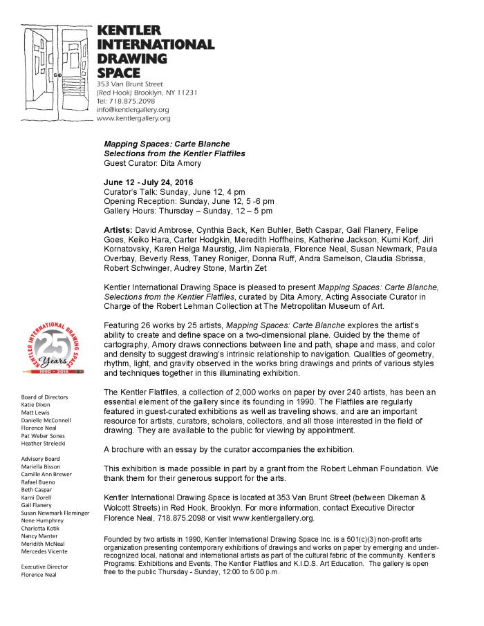
exhibition
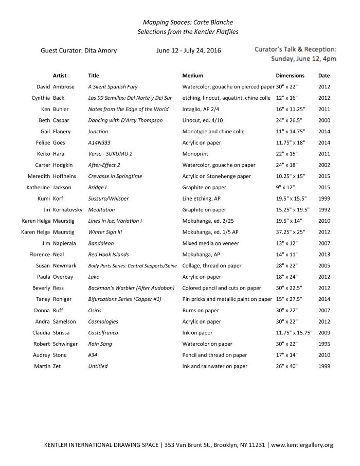
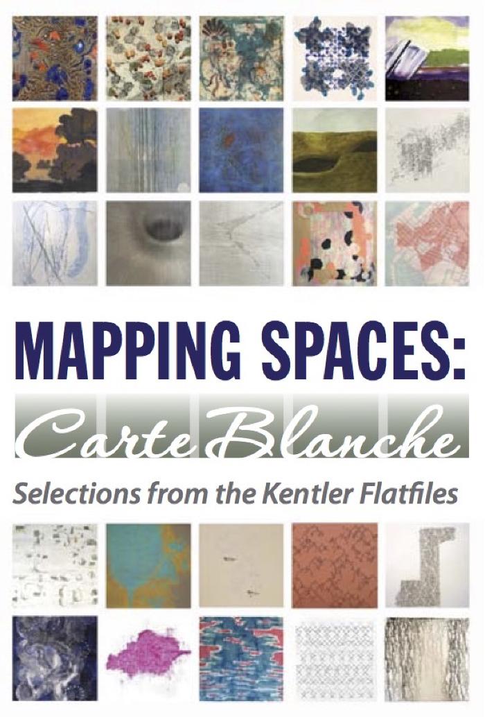
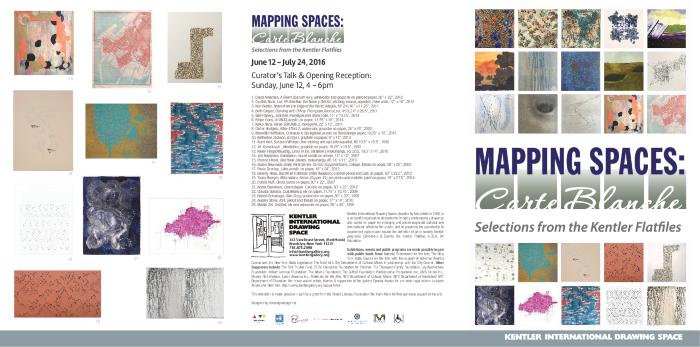
Mapping Spaces: Carte Blanche, Selections from the Kentler Flatfiles
Selections from the Kentler Flatfiles
Date
June 12 – July 24, 2016Opening Reception
June 12, 2016Curated By
Dita AmoryArtists
David Ambrose, Cynthia Back, Ken Buhler, Beth Caspar, Gail Flanery, Felipe Góes, Keiko Hara, Carter Hodgkin, Meredith Hoffheins, Katherine Jackson, Kumi Korf, Jiří Kornatovský, Karen Helga Maurstig, Jim Napierala, Florence Neal, Susan Newmark, Paula Overbay, Beverly Ress, Taney Roniger, Donna Ruff, Andra Samelson, Claudia Sbrissa, Robert Schwinger, Audrey Stone, Martin ZetRelated event
Curator's Talk: Dita Amory, "Mapping Spaces: Carte Blanche"exhibition Images
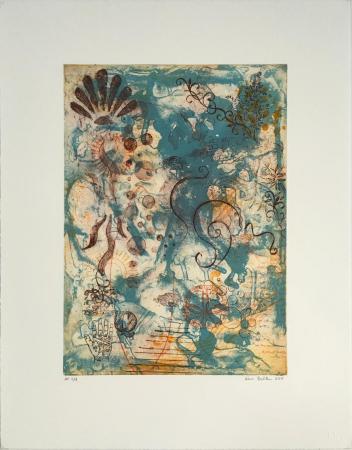
Click to Enlarge.
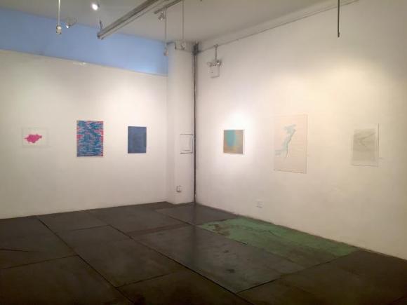
Mapping Spaces: Carte Blanche, Installation photo 1
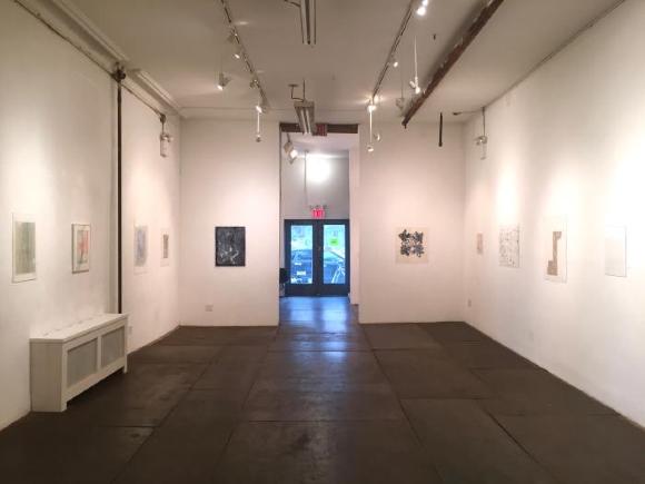
Mapping Spaces: Carte Blanche, Installation photo 2
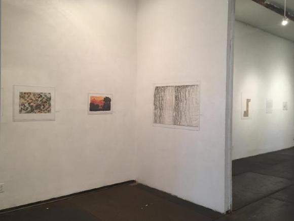
Mapping Spaces: Carte Blanche, Installation photo 3

Press and Promotion
About the exhibition
Mapping Spaces: “Carte Blanche”
When I embarked on this curatorial project, I had no agenda, no familiarity with the art tucked away in Kentler’s Flatfiles. I had “carte blanche” to select an exhibition, an open slate without strategy. I had my eyes as a compass, and that was it. As a curator of historical collections—drawings and paintings neatly filed in the annals of art history—I was on my own in a contemporary arena. The prospect was titillating, heady, and yes, somewhat unsettling. My eye would set the road map, and that was the deal.
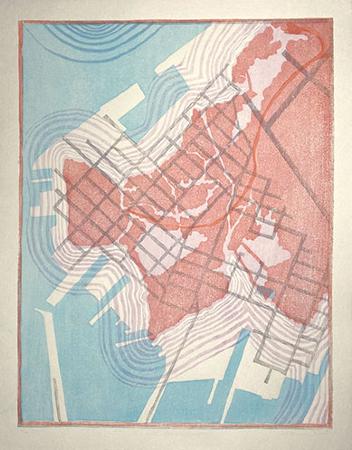
In hindsight, I can tease the reader with way-finding words because the framework for selection took shape quickly and effortlessly. I had a plan in a matter of hours. Whether drawing in ink, watercolor, or graphite on paper, or printing an etching, linocut, or monotype, whether realizing an image additively in collage or reductively through burning holes in paper, whether using a needle and thread to shape an image or letting nature’s rain dribble patterns on an inked sheet, the works of art in this small exhibition coalesce for me as maps. I saw in these many varied expressions, varied in size and media, a selection of disparate artists shaping space. Only one print is an actual map, an aerial view of Red Hook. It blends nonetheless, for its palette and graphic configuration look more aesthetic than navigational!
It may come as a surprise to many of these artists to find their work joined “cartographically.” For what is a map but a carefully calibrated illustration of land and sea—leaving no risk, no window to the haphazard? Maps are tools, manuals, guides for travel, facilitators to ease the unknown. Maps are anathema to creative expression. Yet taken to an aesthetic plane, ignoring geographic facility, the splendid works in this exhibition shape, explore, possess, and transform mass (often pristine white paper) much as early cartographers took charge of the world as they knew it, drafting graphic manuals from empirical research.
At face value, the works on paper in this exhibition would appear to have little commonality. Some artists shape an image by manipulating the paper (or wood), foregrounding materiality as intrinsic to their aesthetics. Others use unconventional drawing “tools” (pins, a lit flame) to pierce patterns in space. For a few artists, process has a greater voice. Some work rigorously in a controlled manner while others count on the uncertain collaboration of the haphazard. Some look to nature for inspiration while others never leave the studio.
Let us give some thought to the affecting polarities that surface in the selection of these drawings and prints as “maps” in the mind’s eye. Some are very obvious—color and its absence, open space versus closed space—while others are less visible: path building versus path finding. There are sheets where the artist has a clear idea of the outcome, its tools, its shape, its message. In others, there is a sense of investigation at play, a dialogue of sorts between the art and its maker. Some give the vantage point of an aerial perspective, not unlike tracking property on Google maps. In these, the map metaphor covers a lot of ground as the lens recedes to amplify space. Other perspectives are more intimate. Some look across space. Many sheets are fully drawn with imagery; perspective has no part. Often the subtle interaction of media articulates the graphic language. Disparate and powerful, the works actually interrelate and subdivide quite willingly into aesthetic alignments that permit their display in one small gallery.
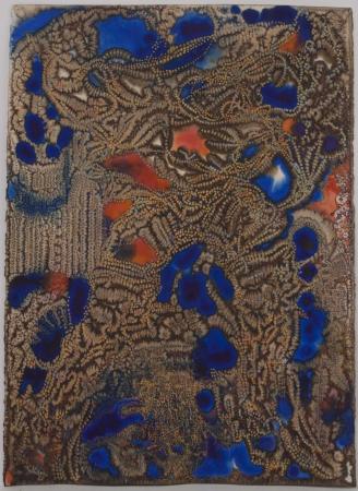
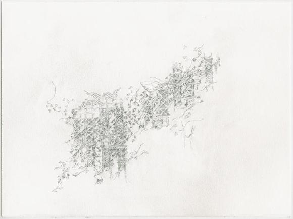
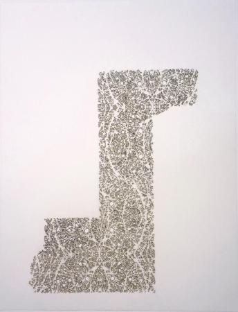
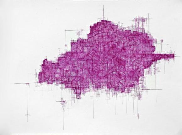
I. Katherine Jackson’s delicate linearity of graphite touches sliding across the paper in Bridge I gives way to a dense mass of tone and line in Claudia Sbrissa’s fuchsia-pink ink drawing. Bridge I is light and airy, lacelike. Sbrissa’s drawing has the effect of a dense, gridded land mass whose edges permeate the perimeter in faint, transparent linear arrangements. Perhaps a puzzle piece is a better metaphor. The effect of aerial land mass is strongly at play in Donna Ruff’s Osiris, an intricate pattern of burn holes on paper where forms and rivulets suggest land and water. The whole design marches in measured draftsmanship, a band of imagery first horizontal, then vertical, then horizontal again, like an alphabet letter in formation. Audrey Stone teases the eye with interconnected parallelograms, some in graphite and some in thread. A pattern of linear yet animated simplicity, the interaction of media and its differentiation trick the eye. In Taney Roniger’s the patterned perforations Bifurcations Series (Copper #1) achieves much the same effect—a metallic board peppered with punctures, dancing in interwoven asymmetry. Threading assumes another role in Susan Newmark’s mixed media sheet. She attaches threads to fragments of book pages like tendrils. White paint, the ground on which these fragments adhere, adds another layer of texture to the amorphous mass of irregular shapes. Newmark writes: “My layering process begins as an improvisation and an appreciation of how torn posters on subway and building walls reveal layers of memory…my surfaces become interwoven networks and dense webs of vision not unlike our packed urban environment.”
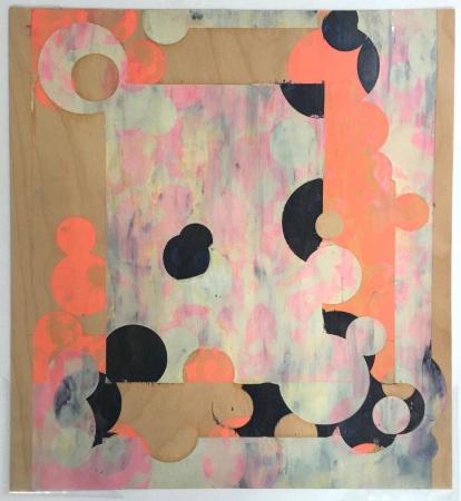
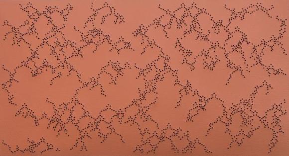
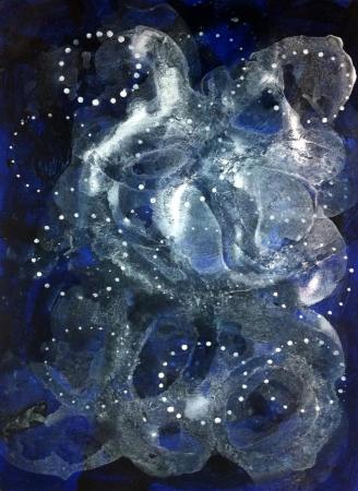
II. Geometry fades in and out of focus in the work of Jim Napierala, Beth Caspar, Andra Samelson, and Ken Buhler. In Napierala’s Bandaleon, circles collide, devolve, disappear, and reappear in the casual grid of a frame beyond which a pink/white/grey background contrasts with the opacity of near-ground geometry. There is spatial tension as circles bounce and pivot in an asymmetry of form and color. Quadrants of olive green delineate the squared field in Caspar’s linoleum print, where blue pods animate the surface, drawing as much attention to the negative as positive space. Pairs of pods fill the voids between quadrants, as if dancing. Their shapes echo in the quadrants in layers. Geometry of another mix shapes Samelson’s ethereal, celestial drawing of the same title where aqueous greys and blues blend interchangeably. A few white dots in circles signal cosmological constellations. Less blended geometry than pictographic forms, Ken Buhler’s intaglio process overlays random imagery in brown against under layers of chalky blue, some of which coalesce in forms we recognize.
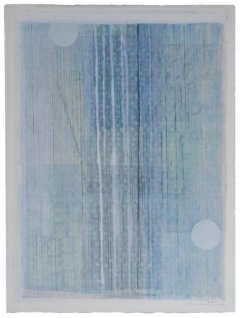
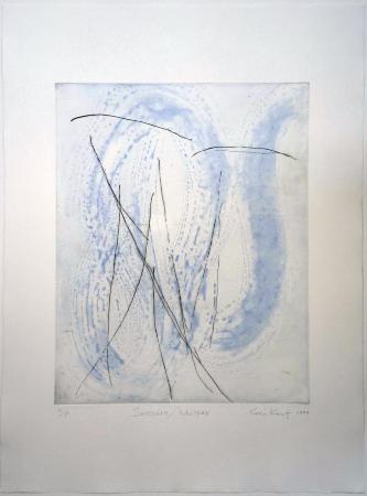
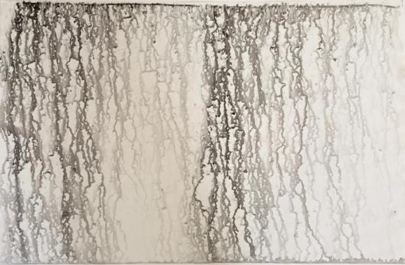
III. Celestial rhythms characterize the abstractions of Keiko Hara and Kumi Korf. Grey horizontal patterns, surrounded by soft, muted tones and evocations of the moon, give Hara’s drawing an Asian peacefulness. Korf’s Sussuro/Whisper contrasts seemingly wet, irregular paint arabesques with random hard-edge lines, suggesting the contrasting properties of drawing media in an etching! Martin Zet partners with nature in his dribble drawings. He travels the world blending rainwater with ink. Water washes the sheet in wondrous, unexpected ways.
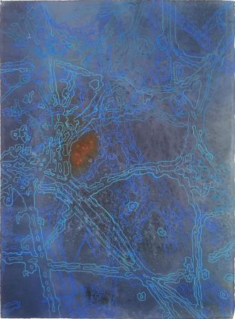
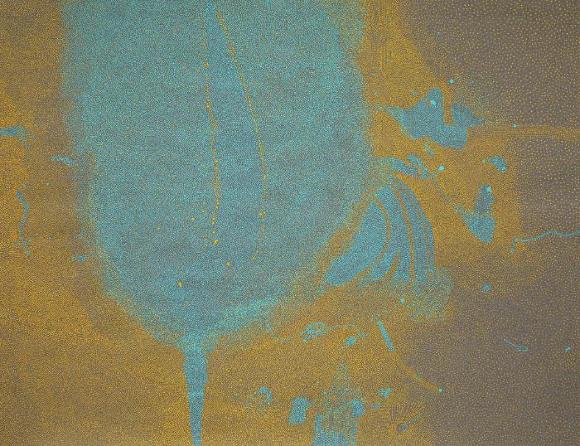
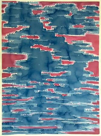
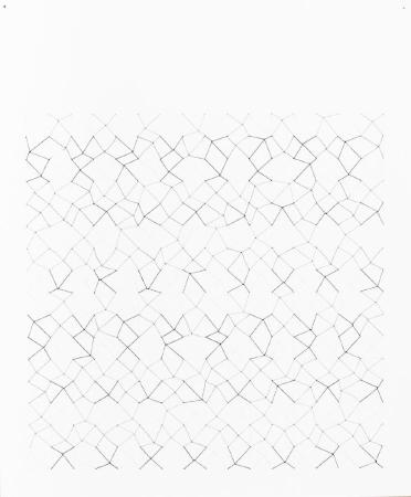
IV. As if seen from a night sky, the drawings of David Ambrose, Robert Schwinger, Paula Overbay, and Carter Hodgkin appear to describe the luminescence of the land below. Ambrose uses a complex technique to manipulate his paper, perforating its surface in a mass of interlocking linear pathways. If watercolored tones of brown denote the earth, one need only imagine the amoeba-like cobalt blues and persimmon reds as breaks in the earth. And how do we transpose Schwinger’s aqueous watercolor to map-like content? Islands in the sea? The drawing has resonance beyond its appealing abstraction. Again with a mapping metaphor in mind, Overbay’s otherworldly subject gives the impression of having been drawn from outer space; hence, the indistinct definition of land and water. Tiny lights add a human presence in the distance. An electrical grid appears to reside in Hodgkin’s sheet, as if seen at a distance. The pathways in blue mark channels of current.
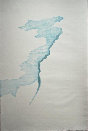
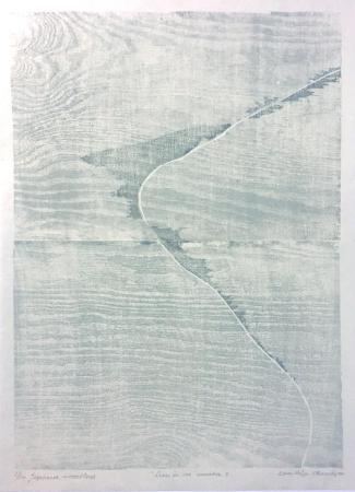
V. Karen Helga Maurstig was an artist-in-residence on the Japanese island of Awaji in 2006. There she learned a wood block printing technique called Mokuhanga. Her Mokuhanga prints in this exhibition evoke land mass, islands in the sea. Taking this evocation one step further, the wood grain in the block print suggests tidal flow in the sea. In both works, Maurstig is attentive to the natural properties of medium and support. If her work abstracts land mass, that of Florence Neal records it. Red Hook Islands notes just that in South Brooklyn. And yet, her swirling grey navigational currents and gridded streets give the sheet a marvelous presence irrespective of cartographic boundaries.
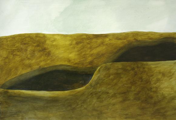
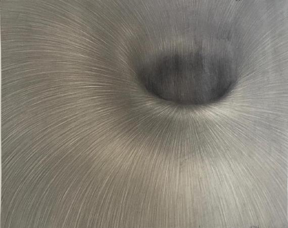
VI. From the celestial to the terrestrial, Meredith Hoffheins’s acrylic paintings come from onsite studies, occasional photographs, and memory. Her Aquifer, conjuring up the earth incised with deep voids, had its start in observation. Small in scale, yet powerful in all its simplicity, the picture has a disquieting effect. Jiri Kornatovsky’s graphite drawing has no anchor in reality, yet its affecting subject could be anywhere—an energy vortex, a sink hole, even a magnified body part. The transformation of a small sheet of paper to suggest raw energy through curving lines of equal weight and measure is a visual feat.
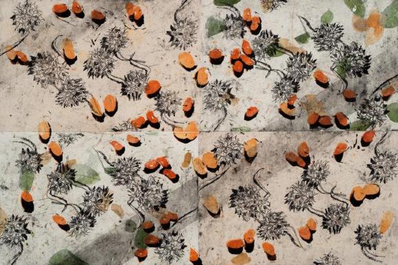
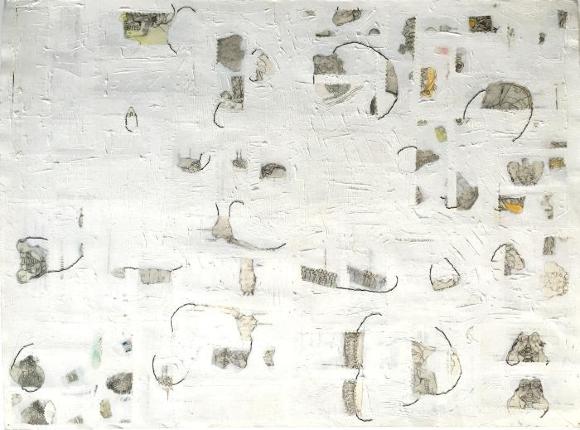
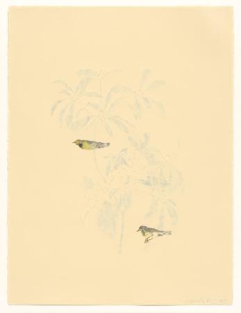
VII. Spatially less ambitious, yet stunning in their own right, are several drawings emerging from science and natural history. Beverly Ress spends time in natural history museums. Her finely detailed birds perch on barely perceptible branches on a sheet otherwise void. Space and gravity, as we know them, are in question. What at first appears a recording of shedding nuts and berries transforms into a much more idiosyncratic subject combining several printing techniques. Cynthia Back merely intimates nature, cluttering an off-white ground of equal curiosity.
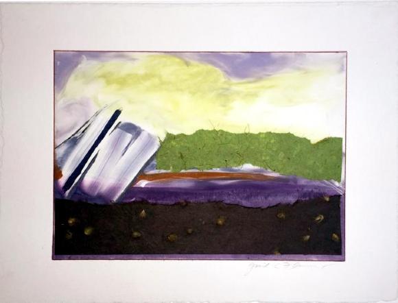
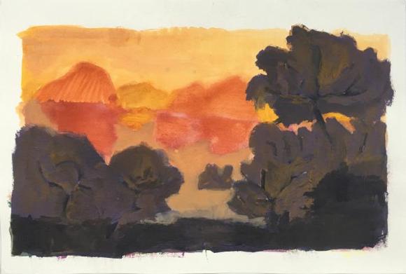
VIII. Mapping has a narrow frame of reference in two small landscapes where the massing of color alludes to land and sky, and the horizon between. The silhouette of dark brown trees against the brilliant orange forms in the distance suggests some fantastical setting in Felipe Goes’s A14N333. Combining media, Gail Flannery uses chine collé over monotype to mark space, while leaving plenty to the imagination.
The mapping metaphor has multiple guises. And while maps themselves have little bearing on this selection of drawings and prints from the Kentler Flatfiles, the process of investigation and discovery that informs their navigational trajectory has its parallel in the many creative pathways chosen for exhibition. It is my hope that the artists will join me in this metaphorical journey. I thank Florence Neal and Sallie Mize for the chance to foreground their fine work.
-- Dita Amory is Acting Associate Curator in Charge of the Robert Lehman Collection at the Metropolitan Museum of Art.